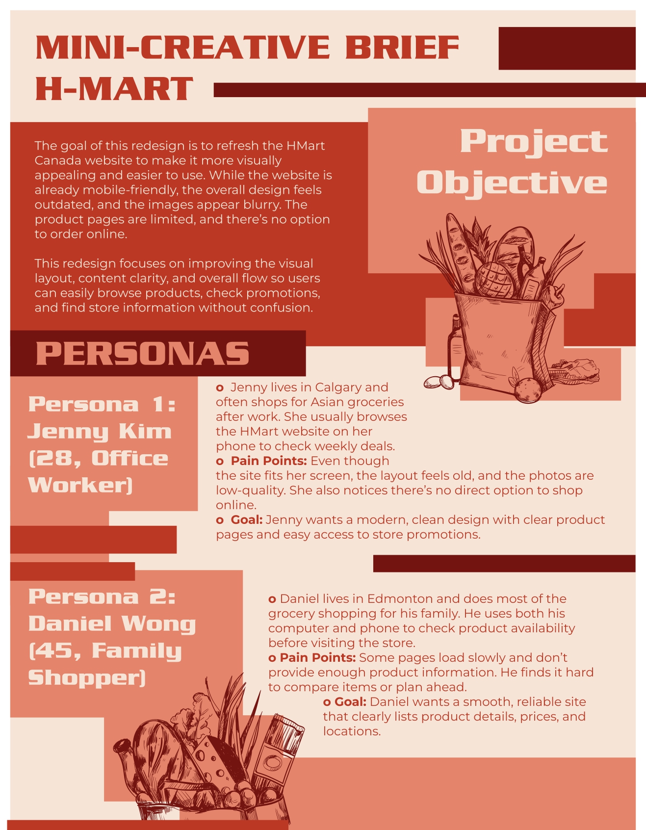
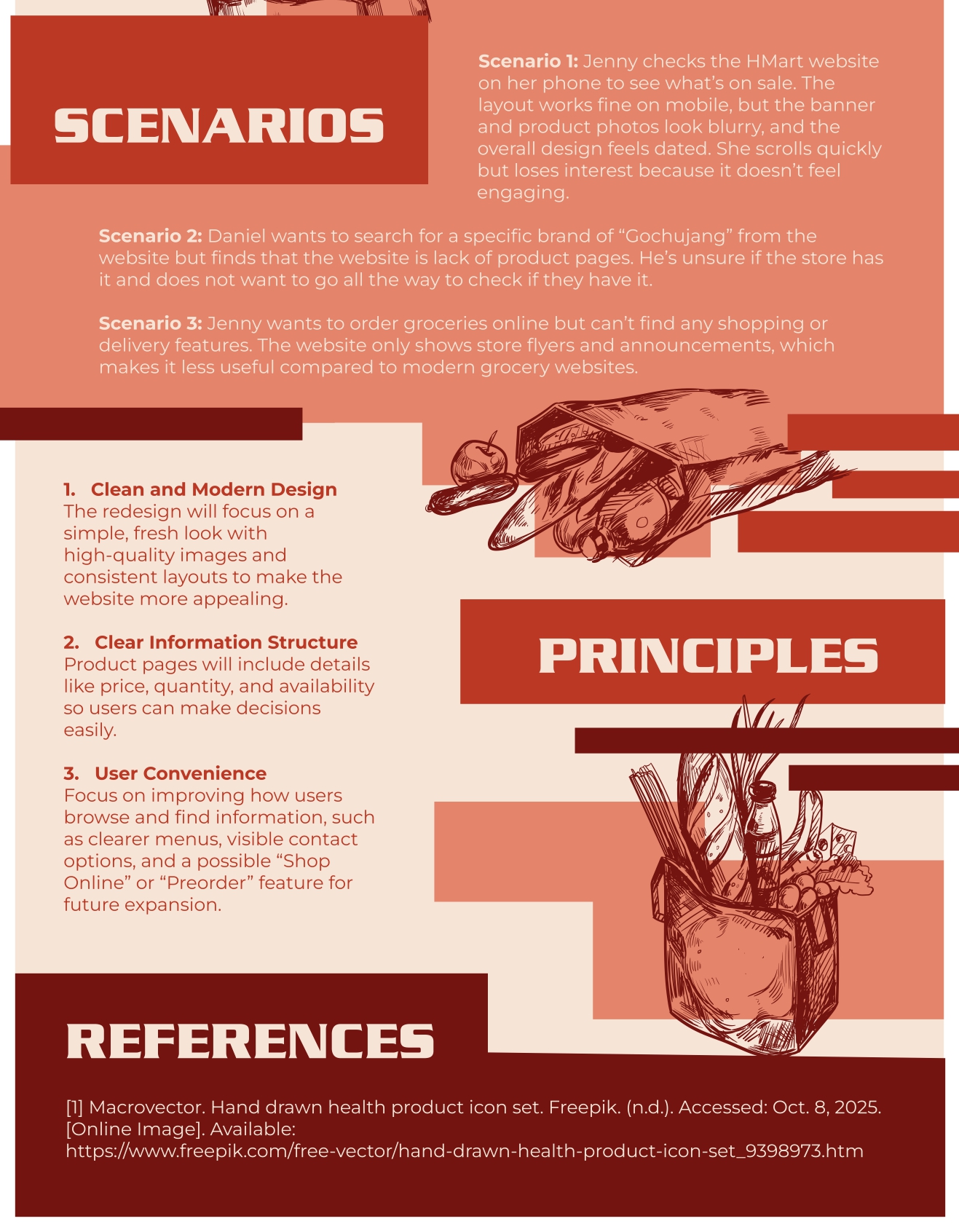
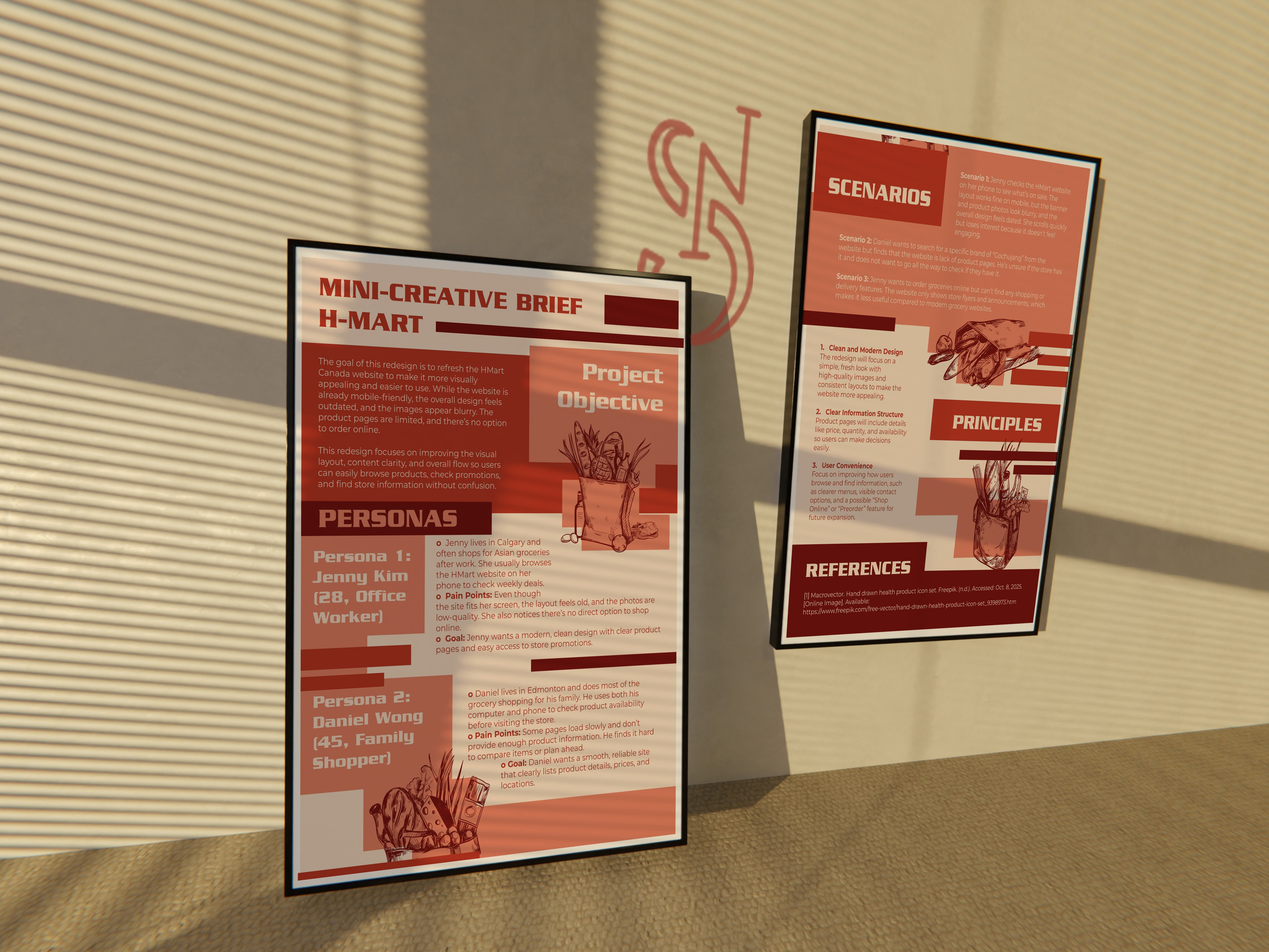
Hmart Mini Creative Brief
Great groceries deserve a better digital experience.
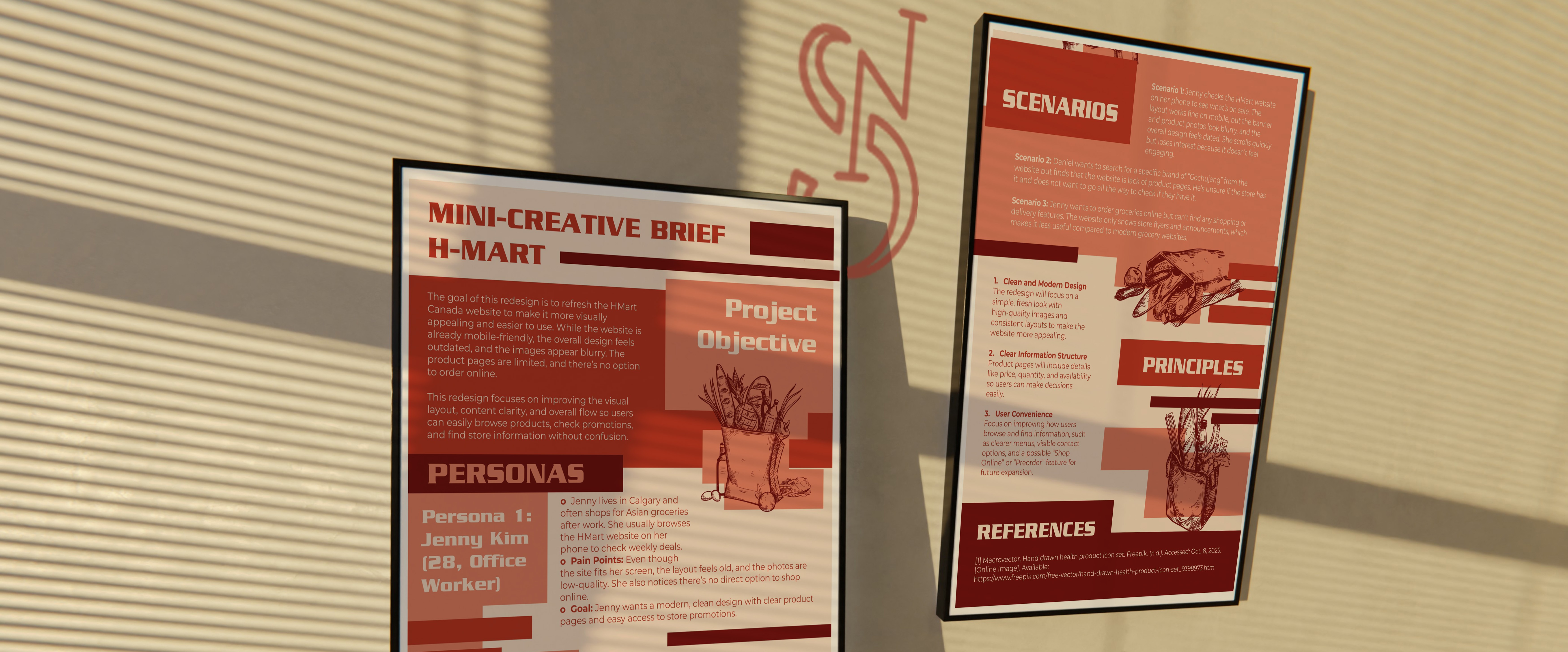
As someone who regularly shops at HMart, I've always appreciated the variety of products and the in-store experience. However, I found the website difficult to engage with. While it provides weekly flyers and store information, the overall interface feels dated, product pages are limited, and online shopping features are missing. This mini creative brief explores how thoughtful UX improvements and a modern visual refresh could make browsing Asian groceries just as enjoyable online as it is in-store.