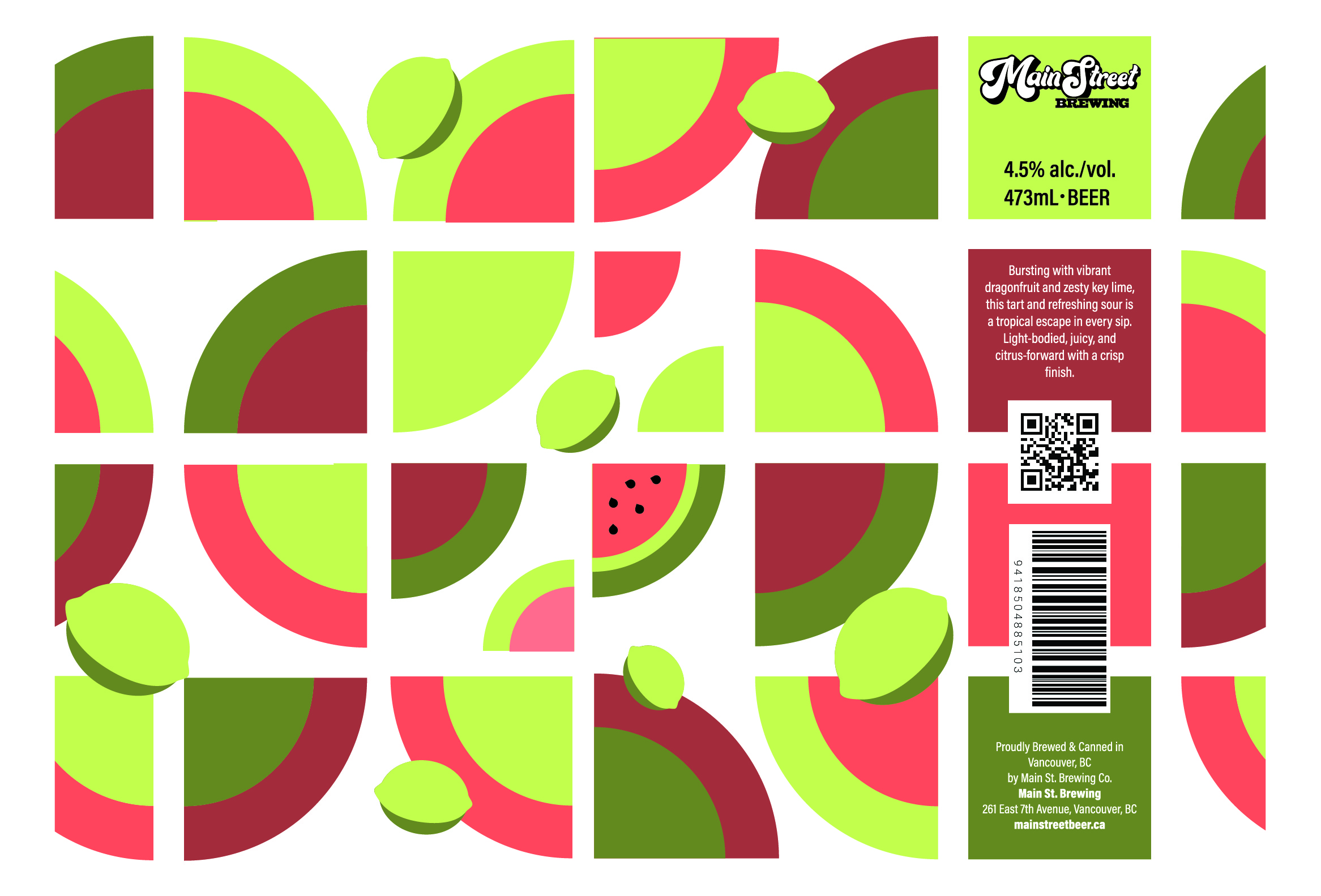
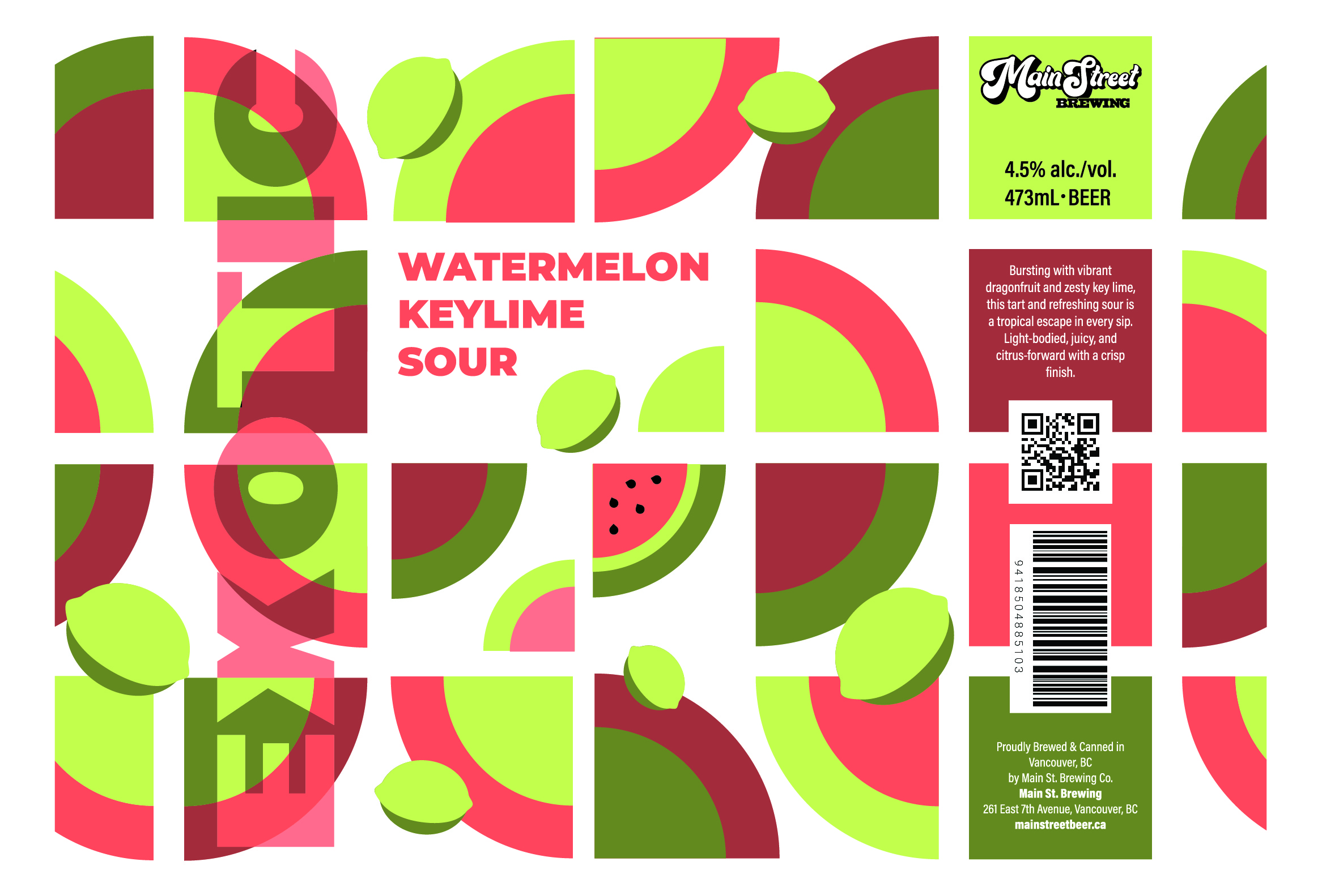
Can redesign
My geometric phase turned into a craft beer label.
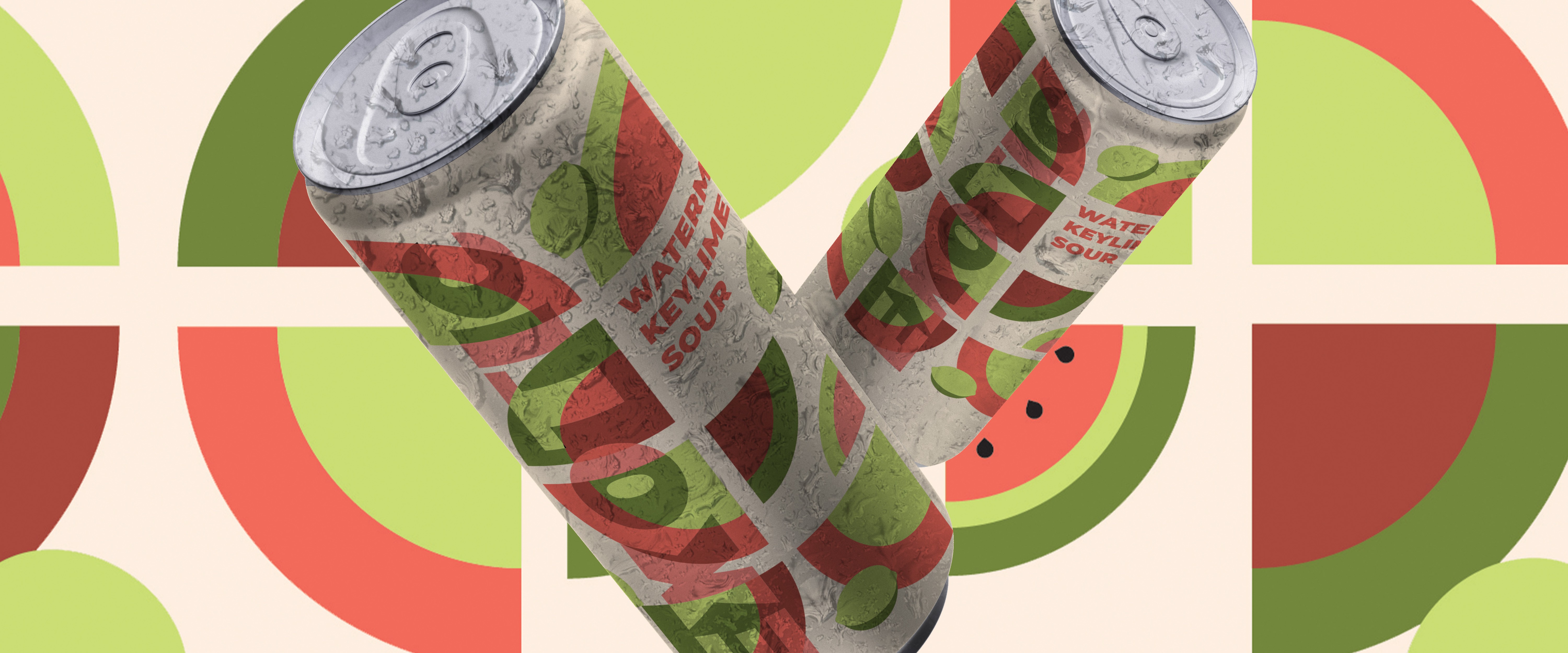
This can design was inspired by Main Street Brewing, whose bold geometric layouts and playful use of color immediately caught my attention. I loved how the packaging felt vibrant and whimsical without becoming visually overwhelming. Around that time, I was really exploring geometric compositions, so this project became a way to experiment with simple shapes, layered forms, and bright color combinations. The result is a refreshing, fruit-forward design that feels energetic, modern, and memorable while letting the flavor speak for itself.